Recently, us VFX students were given a lesson involving silhouettes and their surprisingly wide range of functions and the almost endless things you could construct with them. As an exercise we were given sheets of silhouetted objects (guns for example), and we were asked to create something from these parts.
I found this task to be very enjoyable and enlightening, I didn't appreciate to what extent you could use silhouettes and I actually think this is a good technique to adopt for opening up one's creative channels.
As a crossover between our drawing module and our research module we have been asked to apply our knowledge of anthropomorphic characters to draw our own anthropomorphic character.
We have been given the task of creating an anthropomorphic mascot for the Betty Smithers Design Collection using one of the objects from the collection as inspiration.
Here, I have used a juicer as the base for my character designs, I quite like my ideas but I'm not sure how well they represent the whole collection.
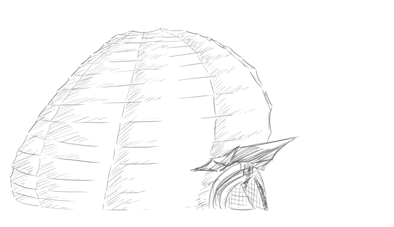
A while ago, we were given the task of creating a building from a selection of different buildings with contrasting architectural styles.
Here are my sources:
And here is my idea:
Sketch:
Clean Sketch:
I was interested in the paper lamp aspect of my design, I thought it would be a very attractive looking building once it was lit up at night; on the inside of the building I imagined there to be multiple floors and near the top of the building I would've put a balcony. If I were to continue with this design I would incorporate a lot more of the Art Nouveau style to it as well as the rounded support beams from the 2nd and 3rd images.
This week (meaning the Tuesday session on 22nd November) the session involved using giant letters placed around the model in order for us to focus on using them as markers when drawing the figure.
I have mixed feelings about the drawings I produced, I feel I did well with using the letters as guides rather than falling into the trap of drawing the letters themselves, but once again my lack of speed meant I couldn't achieve much with each drawing and I found the reclining poses quite difficult. With the final image, I tried to be loose with my lines and rather than follow the form with accuracy I tried to simply capture the general arcs of the forms.
I also found the scaling to be quite a strain this week; I used the scaling technique and started drawing, but after the figure kept seeming to change each time I put charcoal to paper and I got very frustrated with the drawing (number 3 specifically) I resigned myself to just drawing the figure so I would have at least something, but it would turn out correct anyway. I don't know whether to be annoyed by this or pleased as it makes me very unsure about whether I'm scaling things correctly.
This week, we have been asked to post up the draft introduction to our essay in order to identify our strengths and weaknesses when writing formal language.
My Essay Question:
Explore the ways in which the character of Rango embodies the classic Western hero.
(Draft) Introduction:
'Rango' is a critically acclaimed computer animated Western Comedy that follows the journey of a lost pet chameleon who, through his colourful but untrue stories, finds himself appointed Sheriff of the troubled desert town of 'Dirt'; the film shows the trials of this anthropomorphic chameleon on his way to becoming a hero.
Possibly the biggest reason for this film's success is the way that it encapsulates the Western genre, from the character designs that caricature classic Western stereotypes, to the creative references of Western classics that the film drew inspiration from. Rango himself has been constructed from an array of personalities including Hunter S. Thompson and Clint Eastwood.
Through this essay, I aim to explore the ways in which the character of Rango embodies the classic Western hero by breaking the character down and analysing him against the figures he was inspired by; I will also be looking at the anthropomorphic traits of Rango that lend to the more symbolic aspects of the character with regard to representing the Western hero.
This week, we have been asked to write about 1 interesting thing we have done during the week that relates to animation or VFX.
I have decided to review the film 'Season of the Witch' for this post as I saw this film for the very first time during the week.
Overall, the film was flat; the plot was boring and nonsensical at times, the dialogue felt extremely manufactured, and there was no character development at all.
The thing that interested me though was the use of makeup vs VFX within the film.
The VFX was weak and made this film look cheap, and even though the film only had a budget of $40million I felt that the VFX could've been utilised much better than it had been; the fantasy landscapes had been inserted fairly well for example, but it was the creature design that ultimately let the film down- the creatures did not blend well with the live action scenery or the actors that had to interact with them.
However, the physical makeup within the film was extremely well done, to the point where I had to look away at times. A part of the story is the spreading of the Plague or Black Death, thought to be the work of a witch, and so there were a lot of rotting bodies and infected characters. I thought that these makeup effects added a lot of atmosphere to the film and I actually felt more of a threat when the main characters were around Plague victims rather than the supernatural creatures!
I think that this film is a good example of why we shouldn't become too reliant on VFX, it is so readily available that anyone can use it, filmmakers have become lazy in their use of it and audiences have grown so used to it that VFX can no longer carry a film like it used to; in fact, below par VFX can now hurt a film.
Instead, I think that physical effects, such as the ones used in this film, should be used more than they are as they are much more organic than CGI and they connect the audience on a much deeper level.
This week, the focus of our life drawing session was to improve our accuracy through timed segments. We spent the first half of each segment using a light coloured pencil to draw the figure as accurately as possible, and then in the second half we would use a dark coloured pencil to correct our drawing.
I was really disappointed in my performance this week, I couldn't seem to get into the flow of things at all and I found it really hard to start my drawings which did not help my usual lack of speed.
Following our group presentations, we have been asked to use this weeks blog task to reflect on what we've learnt from the presentations of our peers in regards to presentation skills through the following questions:
1) What is one thing you should not do during a presentation?
Do not hide behind your notes, learn your material so that you can use your notes (or better yet key note cards) to aid the flow of your presentation. I noticed quite a few people talking into the sheet of paper in front of them which made it hard to connect to the speaker, also it seemed that people were scared to diverge from their notes so much so that they would back track just to say the sentence exactly as it was written.
2)What is one thing you should do during a presentation?
Engage your audience be it through questions or even a game, this keeps the audience interested in the subject of your presentation and keeps them alert throughout. I thought that the Advertising group did particularly well with this aspect of presenting- they had made large cardboard cutouts of animals along with their mascot counterparts (eg. a tiger, followed by Tony the tiger) and played a game with the audience whereby they had to guess the mascot based on the realistic animal.
We were also asked to note one interesting thing about anthropomorphism that we had learned from one of the presentations given on Wednesday:
One interesting thing I had learned came from the Advertising group; they had found that anthropomorphic characters are often used as mascots for things such as cereal because children cannot differentiate them from the superheroes of the TV shows they were watching on that same channel.
Since there hasn't been a task assigned to us this week, I decided I would share the thoughts I have had whilst preparing for my group presentation; a lot of it won't be used in the presentation but I thought it'd be better to note it here than just let it pass.
I have been assigned the topic of 'technology' within the presentation, and so I have looked at the technology and techniques involved in 3D feature films that help to transfer the humanlike traits of the actors to their anthropomorphised characters and discuss how this technology could affect animation in the future.
Recording/ Referencing- This is a fairly traditional way of capturing the performances of actors and it is still used despite the advances in technology. An example of this is the film 'Shark Tale', these characters have been designed as caricatures of the actors playing them and the animators used footage of the actors as they recorded their lines to reference and recreate the particular expressions and gestures they performed as they acted.
Emotion Capture- The film 'Rango' introduced this technique, the actors perform the scenes together and in costume whilst they are being filmed and (voice) recorded; the animators then reference the footage as they create the animations from scratch. This method spawned from a collaborative effort between people from live action film backgrounds and people from animated film backgrounds, as directors of live action are beginning to cross over into the animation realm they are bringing these new techniques and mind sets to the medium.
Performance Capture- Avatar, though not strictly a 3D feature film, has affected the way in which performances are captured forever. The cameras mounted on helmets are able to record every minute motion within the face and transfer them onto the CG character for a much more in depth performance compared to the frame-by-frame expressions created by animators. Along with this are the cameras that are able to display the 3D world on a monitor so that the director can see the actors 'on set' and direct the scene as if it were a live action scene.
Rise of the Planet of the Apes has taken this a step further by having these performance capture cameras on set (rather than in a warehouse), this allows the actors to play off the surroundings to create an even better performance.
The problems with performance capture however are the boundaries between actors and animators that are slowly being blurred, both party's feel that they may someday become obsolete.
And secondly, the more realistic the character becomes, the greater the chance of falling into the 'Uncanny Valley' which is where a character looks and moves extremely realistically but there is something slightly 'off' about them, this is because the brain no longer perceives the film as animation, but as reality with something wrong about it; this creates an extremely negative reaction from audiences - even the team on Avatar had to work tirelessly to try and avoid this.
TinTin is a perfect example of the Uncanny Valley, the improved performance capture technology and realistic CG mixed with the simplistic and caricatured style has created errily lifelike characters with an appearance that is both human and not human, this has created somewhat of a backlash from audiences.
Overall, animating anthropomorphised characters in a humanlike way can create an effective piece but designing them to be them too humanlike may lead to negative results.
Basically put, a more successful anthropomorphic character is one that captures the realistic human movements of their actors rather than their physical likeness.
As the animation world continues to open up to live action film makers thanks to technology, it will one day be merely a choice between traditionally made animation (whereby the Emotion Capture route would be taken and animators would be the more prominent workforce), or modern/ performance animation (whereby the Performance Capture route would be taken and actors would be the more prominent workforce).
Someday the opportunity to make 3D animated features will be available to everyone through motion capture, and the traditional frame-by-frame animation will become something of an elitist skill- much like the traditional 2D features that are now dying out because of CG animation.
1st November and another life drawing session; our usual tutor was away this week and the teacher that had replaced him seemed to have an extremely different outlook on the subject of life drawing. Accuracy was no longer the focus, this time it was all about capturing the shape and being emotive with our studies.
We used pots of black and white paint, and various sizes of card to apply it with. I found this session to be extremely enjoyable, and I am actually quite proud of my results, I was also very flattered for my pieces to be chosen by some of my peers as their favourites from the session.
Yet again, my lack of speed was a recurring observation made by the tutor and it was incredibly frustrating for me as I was enjoying my paintings so much that I wanted to complete one.
I definitely want to try this technique again in my own time.
The purpose of this session was to get us to look beyond the figure and use the environment around it as a way to find our way around the figure and place and scale things correctly. I think I did fairly well at this, and I felt a lot more confident when it came to approaching my drawings.
The 4th image was a test to see how people would cope with using tone instead of line; I was thoroughly enjoying the drawing but again my lack of speed meant that I didn't get much of it done, and it is times like that when I find my weakness particularly frustrating.
The fourth image was an extremely challenging exercise for me, we were to do each drawing within 2 minutes, using the principles we had learned within the sessions we'd had but not to such a strict extent. I enjoyed the freedom I had with the exercise as it allowed me to use my usual energetic strokes but I really did struggle with getting the figure down in time- I did not complete a single one.
On the 18th October I had my first life drawing session.
For this session the focus was to learn how to scale the figure accurately; I have done life drawing before and have developed my own techniques so I found it very challenging to try and adopt the approach that was being taught during this session, and I think that my internal battle is visible throughout these images.
Again, my lack of speed has been highlighted as my biggest issue, when I think about myself drawing I can never understand what it is that makes me take so long so I will strive to be more aware of my process in the hope I can improve my speed.
One of these pictures was completed bit by bit by everyone in the session through rotation, I would be interested to know who else can spot which one it is.
One of the tasks within the drawing module is to draw 150 post-it notes and then choose the best 50; the purpose of this exercise is to capture the human form in a very short time and with limited space, this pushes you to be more confident with your strokes and to look for the overall gesture of the form rather than the parts that make it up.
With this first batch of notes I am about to show, I did not yet know that humans were supposed to be the focus of the notes and so I tried to draw a variety of things, but as my natural flare is for characters I have mainly drawn people regardless.
Notes 1-23:
When drawing the human form I use big and energetic strokes, so to be constrained to such a tiny space was a challenge for me but I was able to keep the energy of my lines and I'm fairly pleased with some of the gestures I managed to capture.
I will be uploading the next batch of notes within the next few weeks.
We have also been asked to keep a general sketchbook during the module, here are a few pages from mine:
The first image is the result of an upside down drawing exercise, this was a useful exercise because the reference image being upside down forced my eyes to draw the shapes they saw rather than rely on my perceived knowledge of the form.
The second image is the result of a hand-eye coordination exercise, we were asked to look at the person opposite and draw them without looking at the paper. I also seem to have doodled a little after the exercise! Also, there are experiments with mark making on this page.
And then this doodle which spawned from a wondering thought.
And lastly this page, on which I played with the chalk and charcoal I had bought for life drawing; I simply wanted to test out my tools and warm up for the session.
I hope to add more sketches from my drawing module within the next few weeks.
When we started this module, we were asked to draw 5minute thumbnails of robots in order to quickly generate a multitude of ideas from which our chosen robot designs would emerge.
I opted to do silhouettes for this stage, which I then roughly worked into so I could build a basic picture of the robot's design, it took around 15 minutes per robot but I felt that this approach was worth the extra time; and I chose to present them in groups of 3 as it breaks down the choices (for the client to choose from) into bite size chunks so as not to be overwhelming.
The Good:
When approaching the good robots, I imagined them to be aids to the humans who would be performing the main duties of the place, so I designed them to process and relay information between the humans and to computers (for example 1 has holes in his forearms so that jacks could be inserted and it could communicate with machinery) as well as possibly taking on more servant roles (such as 3 and 13).
Though there are a few duds and category confusions among my designs, I am generally happy with the variety I managed to create, particularly with the subtle limitations involved with creating a good robot.
My favourites are 1, 12, 16, and 18; but when choosing the robot I wanted to have as my Good Robot it came down to 1 and 12.
Robot 12 came out on top because I feel that it has a much more fun and iconic design than 1.
The Bad:
With the bad robots there was a lot more opportunity to be creative with my designs as these robots didn't necessarily need to be humanlike.
In general I am fairly pleased with my designs, particularly the ones that I have used textures on, but upon reflection I think I should've made these robots more angular in shape and included more gun type weapons rather than claws etc.
My favourites from this category are 2, 16, and 18; I chose 18 as my Bad Robot because it fits well with my Good and Ugly robots and I have many ideas for refinement with this design.
The Ugly:
When it came to doing the ugly robot designs I was extremely confident with my first idea (robot 1), so I was fairly uninspired with the rest of the designs. With these robots I imagined them as either maintenance, odd jobs, or cleaning robots.
My favourites among this category are 1, 5, 7, and 13 but by the time I finished these designs I was set on robot 1 as my chosen robot. I feel that robot 1 displays its purpose clearly and swiftly whilst still having a bit of character- I was working on a riff of the rundown maintenance guy when designing this robot- and it also matches my Good and Bad robots.
Once I had chosen my 3 robots, I put them onto a height chart (in fact I experimented with 2 different style height charts) in order to compare their sizes and see how they work as a set since they are supposed to be part of the same world.
When I have made frontal images of my 3 robots (their refined versions) I will do another height chart.
From here, I plan to study robotic joints and then refine my designs to look more functional and to look more like a set.