Showing posts with label Digital Presentation 1. Show all posts

Saturday, 24 December 2011

Digital Presentation 1- Post 6

Here, for comparison, I have posted my original height chart with my initial deigns, and then the final height chart with my final designs.

And then below I have posted the design notes that I had compiled whilst studying the work of professional concept artists for my mood boards; I hope that my robots reflect what I had learned during my research.


Design Notes:

The Good: Robots that are built to serve humans or provide intelligence. Also robots that feature prominently in the piece and so need to be designed in such a way that they fulfil the needs of an audience as a protagonist- for example, showing a unique personality through unique features, having an expressive face/ facial features.
Good robots are generally more human looking in order to make them seem trustworthy (NS5, C3PO), they tend to be more brightly coloured or a more attractive metal.
The Bad: 
Robots that are built for combat. Also robots that are the main antagonists of the piece and are designed to make the audience feel threatened or a dislike for them.
Bad robots tend to have claws or weapons for hands, red lights, are more angular/ sharp in shape, more neutral in colour or a more harsh metal, and they are usually more creature like in appearance to distance them from the audience.
Red is a recurring colour for combat or opposing robots because it is a threatening colour, by simply including the colour red in a design, one can drastically change the audience’s interpretation of the robot.
Examples of this include i-robot, the film features the brand new NS5 models of robots, which are sleek and clean in colour, they have an outer shell that is soft and the face is moulded to resemble that of a human face, all this is in aid of making the robots appear upscale and safe, and to make the humans have complete trust in them. But as soon as they light up red, their robot skeleton shows through and their face becomes emotionless,  they become instantly threatening even though their basic design remains the same.
Another example is The Incredibles; the first version of the Omnidroid (the film’s main robotic antagonist) is lit with a blue light and Mr Incredible defeats it without too much difficulty, the improved version is lit with a red light, just from this change the audience automatically registers that this robot, though almost identical in design, is much more of a threat.
The Ugly: Robots that are designed in such a way that their function is obvious as they must show their purpose in a very short amount of screen time. They are only there to fill the world and make it believable as a functioning society, they are generally designed without eye catching features so as not to distract the viewer’s attention from the featured robots.
Ugly robots are fairly simplistic in design, their design ‘matches’ or complements the designs of other, more prominent, robots or surroundings in order to make them believable as a part of the world. They often have logos or company colours painted/grafted onto them.
General Design Notes:
Designers use things from the real world- such as nature or art movements- to influence or feature in their designs, this is so that the designs become more plausible to the audience and so the audience can connect to the designs because they have already seen them before. 
Prominent robots all have a ‘face’, and human/ plant/ animal features/ designs so the audience can identify/ connect with them. 
Most Robots are built either using or greatly resembling the human, or animal, skeleton; this is not only to make the robot relatable to the audience (though it can also serve to make the audience uncomfortable as a lot of humans find it slightly disturbing to see themselves represented without their skin); but it is also because biologically evolved skeletons have perfected the art of movement and so using these same joints and frameworks makes the robots movements as versatile as that of the human or animal it was based from.
Common design elements include a revealed spinal column, spider or crab like legs (more often on bad/combat robots), lenses for eyes, lights, some robots have legs (more often the featured robots) whilst others have wheels (more often the ‘ugly’ robots), exposed parts or wiring, grills.
Though it is much more common to simply design robots to be bare metals, some robots wear or include exterior materials, for example the Stitchpunks (which are the protagonist robots) in ‘9’ wear varying designs of cloth which serve to reflect the times at which each of them were made and also indicate their haphazard creation, and the Beasts (which are the antagonist robots) wear/ are built to include skeletal parts to further emphasise their threatening nature.
In the past, robot designs were generally more bulky, often because the lack of computer generated effects meant that the robot’s design had to accommodate the actor inside of the costume, and because technology of the time was also big and block like these designs were the norm. 
They were mainly built of plain industrial metals, some were rusted and others were a harsh grey- obvious exceptions include C3PO who was a rich and exotic gold, the sleek appearance of which indicated the futuristic time that he was made. 
Newer robot designs have a lot more freedom as they can be created and animated fairly easily through techniques such as motion capture. They are generally smooth and sleek in design and can vary from slim and streamlined in build, to more sturdy and powerful, or a delicate mixture of grace and power. The materials have been modernised from the old metal casing and frantic wiring to the more popular materials of today such as carbon fibre and metals like platinum, and stainless steel- metals that we see in everyday objects such as laptops and mobile phones.
This sleek style has become the norm for todays public and so ‘old’ robots within todays films are designed to model the style of earlier robots and technology to communicate their age.
Cars and Computers/ Hardware today are often made with a combination of metals, and polycarbonate fused with carbon fibre (the smooth white material). The Apple brand of products in particular are extremely trendy today, they are light and smooth and are very dynamic and clean in appearance and so, by using the materials and design features of Apple products (for example), designers are able to make their robots modern, familiar and attractive to todays audience.
A good example of this is the film WALL-E. WALL-E looks like an industrial machine (grimy, bulky, gritty, rusted, muddy colours) such as a garbage truck or digger, whereas EVE looks like something from Mackintosh (sleek, shiny, rounded, clean and dynamic colours). By using the familiar features of a garbage truck and a Mackintosh, the designer is able to communicate the difference in their respective time of creation and their function but make both machines relatable to the audience.

Digital Presentation 1- Post 5

The Ugly:

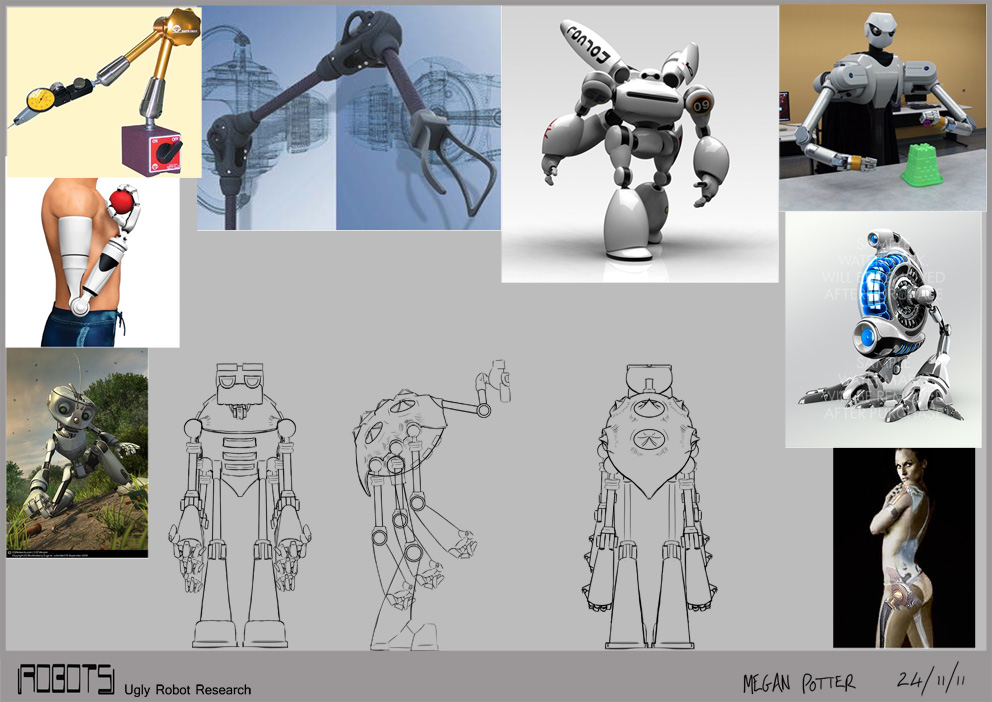
I have always been confident in my ugly robot design as I feel it clearly communicates function whilst also having a lot of personality, so, aside from adding more limbs to sustain the continuity between my robots, my ugly robot only needed refining.

The main objective with my research was to look at joints; my robot uses fairly simple ball and socket joints as well as hinge joints and I wanted to make sure that they still looked functional despite their simplicity


This is my final design, though I forgot to include the tools; I am very happy with with my final design, it maintains the original humour of my initial design but it's functionality is clear and has been enhanced by the addition of extra limbs.


Digital Presentation 1- Post 4

The Bad:

The bad robot was always the one in need of the most improvement, so to generate some ideas I took various parts from my other bad robot designs and tested them on this model.

My concerns with the bad robot were that it lacked visible weapons and that it's legs made it look unstable so I tested a number of different limbs to see how to improve its appearance and make it look more like a bad robot. 


From my research I found that a lot of bad robots were designed with crab/ spider like legs; I thought this would be a great feature for my bad robot as it would make it look more threatening and it would strengthen its stance but I was reluctant to make the change from four limbs because I felt that it would ruin the continuity between my three robots.

With this in mind I tried to work out how my robot stands and moves (I figured it would resemble the way a gorilla moves) but I found that with four limbs it would be very restricted in it's movements as it would have to have an arm down to support it at all times in order to keep it standing.

So I looked further into the idea of giving my bad robot more legs and found that it did indeed solve all of the issues with stance and movement that it had; and as for continuity, I decided I would solve this by giving my other two robots additional limbs as well which actually made a lot of sense when considering their functions.


I did some research into robots with crab/ spider like legs, looking at real world examples so that I would know how to make my design more convincing; I liked the sharp appearance of the mechanical arms (bottom left images) and I had this look in mind when first designing this robot so I wanted to keep and refine this feature.


This is my final design for my bad robot; if I were to continue making improvements I would like to refine the arms further but overall I am fairly happy with this deign.


Digital Presentation 1- Post 3

The Good:

I was most confident with my good robot design and felt that it needed the least amount of tweaking so I focused on refining the design; I looked at hydraulic components in order to gain an understanding of how they work and then applied them to my robot, figuring that the parts sticking out of his back would bend and straighten the body.


Once I had refined my design I explored colours; I liked the sleek look of my robot and felt that it would work fine in grayscale but I thought a bit of colour might enhance the 'friendliness' of my robot. I like numbers 3, 5 and 8 as they keep the sleek look but each offers a different feel.


This is the final design for my good robot; I am extremely pleased with my design as it has a fun and friendly appearance and doesn't look like a generic robot.


Wednesday, 2 November 2011

Digital Presentation 1- Post 2

When we started this module, we were asked to draw 5minute thumbnails of robots in order to quickly generate a multitude of ideas from which our chosen robot designs would emerge.

I opted to do silhouettes for this stage, which I then roughly worked into so I could build a basic picture of the robot's design, it took around 15 minutes per robot but I felt that this approach was worth the extra time; and I chose to present them in groups of 3 as it breaks down the choices (for the client to choose from) into bite size chunks so as not to be overwhelming.

The Good:


When approaching the good robots, I imagined them to be aids to the humans who would be performing the main duties of the place, so I designed them to process and relay information between the humans and to computers (for example 1 has holes in his forearms so that jacks could be inserted and it could communicate with machinery) as well as possibly taking on more servant roles (such as 3 and 13).

Though there are a few duds and category confusions among my designs, I am generally happy with the variety I managed to create, particularly with the subtle limitations involved with creating a good robot.

My favourites are 1, 12, 16, and 18; but when choosing the robot I wanted to have as my Good Robot it came down to 1 and 12. 
Robot 12 came out on top because I feel that it has a much more fun and iconic design than 1.


The Bad:


With the bad robots there was a lot more opportunity to be creative with my designs as these robots didn't necessarily need to be humanlike.

In general I am fairly pleased with my designs, particularly the ones that I have used textures on, but upon reflection I think I should've made these robots more angular in shape and included more gun type weapons rather than claws etc.

My favourites from this category are 2, 16, and 18; I chose 18 as my Bad Robot because it fits well with my Good and Ugly robots and I have many ideas for refinement with this design.


The Ugly:


When it came to doing the ugly robot designs I was extremely confident with my first idea (robot 1), so I was fairly uninspired with the rest of the designs. With these robots I imagined them as either maintenance, odd jobs, or cleaning robots. 

My favourites among this category are 1, 5, 7, and 13 but by the time I finished these designs I was set on robot 1 as my chosen robot. I feel that robot 1 displays its purpose clearly and swiftly whilst still having a bit of character- I was working on a riff of the rundown maintenance guy when designing this robot- and it also matches my Good and Bad robots.


Once I had chosen my 3 robots, I put them onto a height chart (in fact I experimented with 2 different style height charts) in order to compare their sizes and see how they work as a set since they are supposed to be part of the same world.


When I have made frontal images of my 3 robots (their refined versions) I will do another height chart.

From here, I plan to study robotic joints and then refine my designs to look more functional and to look more like a set.

Thursday, 13 October 2011

Digital Presentation 1- Post 1

Summer Brief:

The summer brief for my course, and this module, was to research robots from films, games, and other media, and organise them into the categories 'Good', 'Bad', and 'Ugly'. The boards would serve the purpose of helping us to generate our initial ideas for the first 'Digital Presentation' module which is to design three robots- one of each category- and produce turnaround sheets for them.

As these mood boards were supposed to help me come up with ideas for concept designs, I felt that it would be beneficial to include concept designs from professional concept artists and their recent projects so that I could see how they have taken current design trends and manipulated them for use in their robot designs.

I also wanted to create the boards in a way that would clearly convey the overall 'feel' of that particular category with just a glance; to do this I included swatches and organised my images so that the textures and colours of the robots would stand out.

I gained a lot of insight through the research and organisation of these boards and gathered enough design notes to fill 2 pages, snippets of which accompany photos of my mood boards and their reference sheets below:


Good Robots are robots that provide intelligence and generally aid humans, also robots that feature within the piece as a protagonist.
They are generally sleek and clean in design, and often resemble humans- note, they all have a face- in order to convince the viewers of their trustworthiness.


Bad robots are robots that are built for combat, also robots that feature within the piece as an antagonist.
They are more sharp/ angular in shape and are often lit or coloured red to make them appear threatening; they are generally more creature like in appearance in order to distance them from the viewers.


Ugly robots are robots that have been designed with function as the main focus instead of the aesthetics of the good and bad robots, they serve to fill the world of the piece. 
Their function must be obvious as they must portray it within a very short amount of screen time (they are often seen purely in the background or in cutaway shots), and they are generally designed without eye catching features so they do not distract from the featured robots of the piece.


These categories cross over depending on one's focus i.e. design vs plot. Wall-E is a prime example of this as he is a garbage compactor and has a design that resembles something of a garbage truck merged with a JCB (therefore 'Ugly'); but he is also the main protagonist of the film and so his design shows a lot of personality, mainly through his camera eyes which have been tilted and the lenses enlarged to give him a sympathetic "puppy dog" eyed look (therefore 'Good').


I hope to post my initial design ideas within the next week or so, and hopefully they will display the understanding I feel I have gained through this task.