Saturday, 24 December 2011

Digital Presentation 1- Post 6

Here, for comparison, I have posted my original height chart with my initial deigns, and then the final height chart with my final designs.

And then below I have posted the design notes that I had compiled whilst studying the work of professional concept artists for my mood boards; I hope that my robots reflect what I had learned during my research.


Design Notes:

The Good: Robots that are built to serve humans or provide intelligence. Also robots that feature prominently in the piece and so need to be designed in such a way that they fulfil the needs of an audience as a protagonist- for example, showing a unique personality through unique features, having an expressive face/ facial features.
Good robots are generally more human looking in order to make them seem trustworthy (NS5, C3PO), they tend to be more brightly coloured or a more attractive metal.
The Bad: 
Robots that are built for combat. Also robots that are the main antagonists of the piece and are designed to make the audience feel threatened or a dislike for them.
Bad robots tend to have claws or weapons for hands, red lights, are more angular/ sharp in shape, more neutral in colour or a more harsh metal, and they are usually more creature like in appearance to distance them from the audience.
Red is a recurring colour for combat or opposing robots because it is a threatening colour, by simply including the colour red in a design, one can drastically change the audience’s interpretation of the robot.
Examples of this include i-robot, the film features the brand new NS5 models of robots, which are sleek and clean in colour, they have an outer shell that is soft and the face is moulded to resemble that of a human face, all this is in aid of making the robots appear upscale and safe, and to make the humans have complete trust in them. But as soon as they light up red, their robot skeleton shows through and their face becomes emotionless,  they become instantly threatening even though their basic design remains the same.
Another example is The Incredibles; the first version of the Omnidroid (the film’s main robotic antagonist) is lit with a blue light and Mr Incredible defeats it without too much difficulty, the improved version is lit with a red light, just from this change the audience automatically registers that this robot, though almost identical in design, is much more of a threat.
The Ugly: Robots that are designed in such a way that their function is obvious as they must show their purpose in a very short amount of screen time. They are only there to fill the world and make it believable as a functioning society, they are generally designed without eye catching features so as not to distract the viewer’s attention from the featured robots.
Ugly robots are fairly simplistic in design, their design ‘matches’ or complements the designs of other, more prominent, robots or surroundings in order to make them believable as a part of the world. They often have logos or company colours painted/grafted onto them.
General Design Notes:
Designers use things from the real world- such as nature or art movements- to influence or feature in their designs, this is so that the designs become more plausible to the audience and so the audience can connect to the designs because they have already seen them before. 
Prominent robots all have a ‘face’, and human/ plant/ animal features/ designs so the audience can identify/ connect with them. 
Most Robots are built either using or greatly resembling the human, or animal, skeleton; this is not only to make the robot relatable to the audience (though it can also serve to make the audience uncomfortable as a lot of humans find it slightly disturbing to see themselves represented without their skin); but it is also because biologically evolved skeletons have perfected the art of movement and so using these same joints and frameworks makes the robots movements as versatile as that of the human or animal it was based from.
Common design elements include a revealed spinal column, spider or crab like legs (more often on bad/combat robots), lenses for eyes, lights, some robots have legs (more often the featured robots) whilst others have wheels (more often the ‘ugly’ robots), exposed parts or wiring, grills.
Though it is much more common to simply design robots to be bare metals, some robots wear or include exterior materials, for example the Stitchpunks (which are the protagonist robots) in ‘9’ wear varying designs of cloth which serve to reflect the times at which each of them were made and also indicate their haphazard creation, and the Beasts (which are the antagonist robots) wear/ are built to include skeletal parts to further emphasise their threatening nature.
In the past, robot designs were generally more bulky, often because the lack of computer generated effects meant that the robot’s design had to accommodate the actor inside of the costume, and because technology of the time was also big and block like these designs were the norm. 
They were mainly built of plain industrial metals, some were rusted and others were a harsh grey- obvious exceptions include C3PO who was a rich and exotic gold, the sleek appearance of which indicated the futuristic time that he was made. 
Newer robot designs have a lot more freedom as they can be created and animated fairly easily through techniques such as motion capture. They are generally smooth and sleek in design and can vary from slim and streamlined in build, to more sturdy and powerful, or a delicate mixture of grace and power. The materials have been modernised from the old metal casing and frantic wiring to the more popular materials of today such as carbon fibre and metals like platinum, and stainless steel- metals that we see in everyday objects such as laptops and mobile phones.
This sleek style has become the norm for todays public and so ‘old’ robots within todays films are designed to model the style of earlier robots and technology to communicate their age.
Cars and Computers/ Hardware today are often made with a combination of metals, and polycarbonate fused with carbon fibre (the smooth white material). The Apple brand of products in particular are extremely trendy today, they are light and smooth and are very dynamic and clean in appearance and so, by using the materials and design features of Apple products (for example), designers are able to make their robots modern, familiar and attractive to todays audience.
A good example of this is the film WALL-E. WALL-E looks like an industrial machine (grimy, bulky, gritty, rusted, muddy colours) such as a garbage truck or digger, whereas EVE looks like something from Mackintosh (sleek, shiny, rounded, clean and dynamic colours). By using the familiar features of a garbage truck and a Mackintosh, the designer is able to communicate the difference in their respective time of creation and their function but make both machines relatable to the audience.

Digital Presentation 1- Post 5

The Ugly:

I have always been confident in my ugly robot design as I feel it clearly communicates function whilst also having a lot of personality, so, aside from adding more limbs to sustain the continuity between my robots, my ugly robot only needed refining.

The main objective with my research was to look at joints; my robot uses fairly simple ball and socket joints as well as hinge joints and I wanted to make sure that they still looked functional despite their simplicity


This is my final design, though I forgot to include the tools; I am very happy with with my final design, it maintains the original humour of my initial design but it's functionality is clear and has been enhanced by the addition of extra limbs.


Digital Presentation 1- Post 4

The Bad:

The bad robot was always the one in need of the most improvement, so to generate some ideas I took various parts from my other bad robot designs and tested them on this model.

My concerns with the bad robot were that it lacked visible weapons and that it's legs made it look unstable so I tested a number of different limbs to see how to improve its appearance and make it look more like a bad robot. 


From my research I found that a lot of bad robots were designed with crab/ spider like legs; I thought this would be a great feature for my bad robot as it would make it look more threatening and it would strengthen its stance but I was reluctant to make the change from four limbs because I felt that it would ruin the continuity between my three robots.

With this in mind I tried to work out how my robot stands and moves (I figured it would resemble the way a gorilla moves) but I found that with four limbs it would be very restricted in it's movements as it would have to have an arm down to support it at all times in order to keep it standing.

So I looked further into the idea of giving my bad robot more legs and found that it did indeed solve all of the issues with stance and movement that it had; and as for continuity, I decided I would solve this by giving my other two robots additional limbs as well which actually made a lot of sense when considering their functions.


I did some research into robots with crab/ spider like legs, looking at real world examples so that I would know how to make my design more convincing; I liked the sharp appearance of the mechanical arms (bottom left images) and I had this look in mind when first designing this robot so I wanted to keep and refine this feature.


This is my final design for my bad robot; if I were to continue making improvements I would like to refine the arms further but overall I am fairly happy with this deign.


Digital Presentation 1- Post 3

The Good:

I was most confident with my good robot design and felt that it needed the least amount of tweaking so I focused on refining the design; I looked at hydraulic components in order to gain an understanding of how they work and then applied them to my robot, figuring that the parts sticking out of his back would bend and straighten the body.


Once I had refined my design I explored colours; I liked the sleek look of my robot and felt that it would work fine in grayscale but I thought a bit of colour might enhance the 'friendliness' of my robot. I like numbers 3, 5 and 8 as they keep the sleek look but each offers a different feel.


This is the final design for my good robot; I am extremely pleased with my design as it has a fun and friendly appearance and doesn't look like a generic robot.


Tuesday, 13 December 2011

Research For Animation & VFX- Post 14

When I decided to do my essay on 'Rango', it prompted me to finally buy 'The Ballad of Rango'; I adore 'art of' books and this was one I had my eye on for a long time so to have a valid excuse to get it made me very happy!


I learnt a lot from this book in terms of research for my essay; I found it very interesting how small the team was in the beginning of the project, and that they came from a wide range of areas within the film industry.

I also learnt a lot about how Rango's design was constructed, for example Rango's tail is an extension of his personality and shows his emotions, when he is depressed his tail unravels from a coil to drag behind him. Another interesting fact is that all of his teeth were individually controlled for animation.

Here, I posted a lot of the design notes I wrote after analysing the DVD myself and reading this book:


http://meganpotterconceptartist.blogspot.com/2011/10/research-for-animation-vfx-post-2.html

Monday, 12 December 2011

Research For Animation & VFX- Post 13

During the early stages of my research, I looked to things such as the bonus features and promotional material from 'Rango' to get some insight into how the film was designed and made. Much like the film itself, the production of 'Rango' was truly unique and innovative, so I wanted to share these behind the scenes videos of the cast shooting for the film with the never before used technique of 'Emotion Capture'.


Whilst I was studying for the group presentation I learnt about a lot of techniques used to capture performances for animated characters and how they are evolving, as well as the disadvantages with each of them. 
Here is the post for that information:

This research furthered my belief that the 'Emotion Capture' technique used for 'Rango' is the perfect way for animation to evolve. 
One of the biggest fears for actors and animators is the 'Performance/ Motion Capture' technique, the actors fear that once their performance has been captured they no longer have a say in what happens to it and it will be free for the filmmakers to manipulate it in any way they wish; animators fear that they will be put out of a job because of this technology.
With the 'Emotion Capture' technique, the actors play their parts in a mostly natural way, using costumes and each other to help them get into their character, and act out their scenes with cameras and the director with them as with any normal set. Then the animators use the footage for deep reference whilst they create the animations from scratch.
This technique allows all parties to make the most of their talents and work as a team to create what I feel is some of the best animation to date.

Sunday, 11 December 2011

Research For Animation & VFX- Post 12

Whilst researching for my essay, I came across this review and found it quite an irritating read. This is one of the few bad reviews of Rango that were published, and upon reading it I couldn't help but feel like this reviewer wanted a generic kids movie.


http://www.chicagotribune.com/entertainment/movies/sc-mov-0301-rango-20110302,0,2955955.column


I appreciate that everyone is entitled to their own opinions, but I take issue with a few things that were said:


As a family-demographic product "Rango" has a million selling points, among them an unusually strong voice cast headed by Johnny Depp in tremulous-aesthete mode; a popular live-action director making his feature animation debut; and a twist on a genre temporarily back in vogue, thanks to "True Grit."


So, at what point is a child going to announce their desire to see a film from things like a director or an actor, or a trend in cinema? Rango is a Western (remember playing cowboys and indians in your youth?) and the cast are anthropomorphic animals- that is the selling point for a child. I also suspect that the average movie goer won't care about the strength of the acting cast or the debut animation from a director, they will judge the trailer or word of mouth.


"When computer-generated animation sticks this closely to photorealistic landscapes and gunplay and menace, even with a cast of animated lizards and prairie dogs and birds does the result feel like something for kids?"


The whole review gave me the impression that this reviewer simply cannot get past the notion that not all animation is for children and so he attacked the film for its particular brand of humour and style. Rango was never intended to be strictly for children, it was created to be an animated Western above all else.


Regardless of that fact, I think that children are majorly underrated in their intelligence and appreciation for film and I wish that films would stop dumbing down their material to reach the ever younger audience.

Saturday, 10 December 2011

Research For Animation & VFX- Post 11

During my research I have flicked through quite a few books on Westerns, the two I chose to study a little more in depth are:


This book is a compilation of articles written about (strictly) Hollywood made Westerns dating from the 1940s onwards, looking particularly at the A movies of the genre. I found it interesting to read from a variety of authors who were able to offer a number of different views on the same themes, and the articles included in this book discuss quite unique issues that actually contribute to the genre a great deal. For example one article discusses the body of John Wayne, he has many images in the public eye- John Wayne the legend, John Wayne as the character, and John Wayne the man; the article studies how these contrasting personas are limited by this one body that they all have to share.

And


This book interested me because it focused more on the actuality of Western life and culture and how it had been manipulated for use in Western films. I particularly liked the encyclopaedia layout of facts as it meant I could easily look up a film or director and find the relevant information about them.


In regards to my essay, I have found the former book 'The Movie Book of Westerns' to be quite useful as it discussed the personalities of some of the most iconic Western characters which is useful for my study on the classic Western hero.

Friday, 9 December 2011

Drawing- Post 11

Last week, we were asked to pick one of our life drawings and digitally paint it. 

I have dabbled in digital painting before but I've never felt confident in my abilities when it comes to digital painting; I enjoy painting with real oil paints as they do not dry quickly- which suits my slow and thorough way of working- and they blend extremely well which allows me to create more detailed works than other mediums. So, when working digitally I usually choose oils in the hope I can achieve the same effect as the real thing.

For this piece, I tried to keep the painting simple and warm; I am fairly pleased with my results, especially as I had to work out a lot of the details in the lighting and anatomy myself. I think this painting could be worked into a lot further but I feel reluctant to keep messing with it as I feel it already communicates everything I was aiming for it to at this stage.


Also, here is the link to my Flickr account (though there is nothing on there that isn't already on here!): http://www.flickr.com/photos/68540999@N02/

Thursday, 8 December 2011

Research For Animation & VFX- Post 10/ Drawing- Post 10

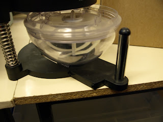
Today I went to see the Betty Smithers Design Collection; I found it to be a very useful experience, mainly because it made me realise that no one object could define this collection and that gave me a lot more confidence in the designs I had done, particularly the juice lady. I also got to photograph the original juicer I had used for my designs and was able to create a better image from them.


The Betty Smithers Design Collection: Celebrating Design Through The Ages


I also found a very interesting looking coffee maker/ mixer (I'm not sure what it is exactly), to me it looked like a robot which I found interesting as this was an old design and I tried to incorporate this idea into the mascot design I made from it.


The Betty Smithers Design Collection: Looking To The Past To Design The Future


I really like the juicer lady design that I have done as I feel it is bold and simple which would suit as a logo that can be put on merchandise. In terms of anthropomorphism, I like that the object itself has been turned into an extension (dress) of its function (juicer lady) and hasn't simply had eyes added to it as is the case with many anthropomorphic objects.

Tuesday, 6 December 2011

Drawing- Post 9

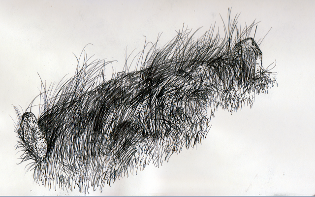
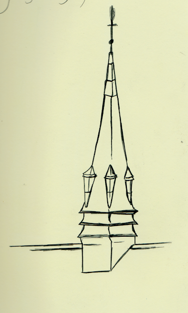
A short while ago I visited my home town, and while I was there I spent a weekend drawing in the graveyards nearby; I know that the original task was to draw in Hanley cemetery but since the task was more about mark making I hope that the cemeteries of Herne Bay will suffice.

I used a fineliner pen to create these drawings, using techniques such as hatching and stippling (which is a particular favourite of mine), I think that using the pen made me focus more and work faster as each stroke was a definite one so I had to be confident in my marks. I also brought along my watercolours but it is not my favourite medium, still, I think I managed to create a couple of nice pictures with them- I particularly like the texture of the gravestones.