Thursday, 8 December 2011

Research For Animation & VFX- Post 10/ Drawing- Post 10

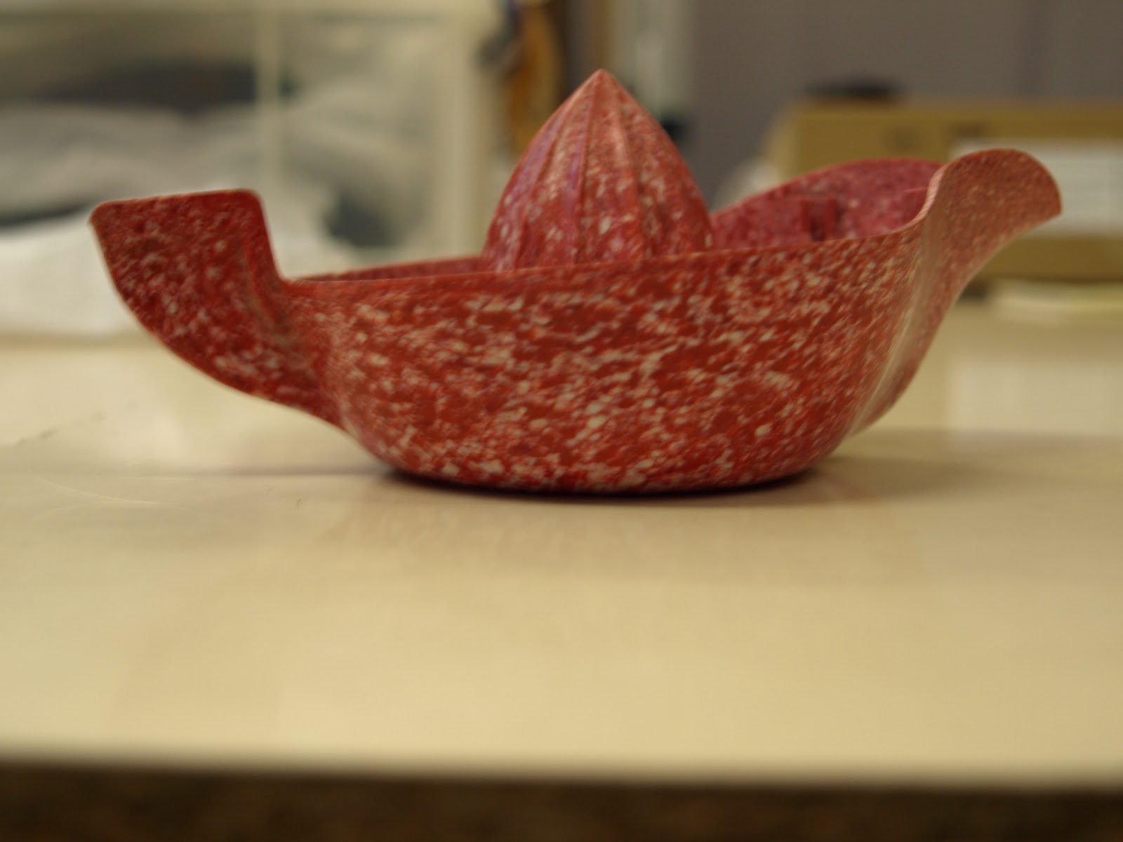
Today I went to see the Betty Smithers Design Collection; I found it to be a very useful experience, mainly because it made me realise that no one object could define this collection and that gave me a lot more confidence in the designs I had done, particularly the juice lady. I also got to photograph the original juicer I had used for my designs and was able to create a better image from them.


The Betty Smithers Design Collection: Celebrating Design Through The Ages


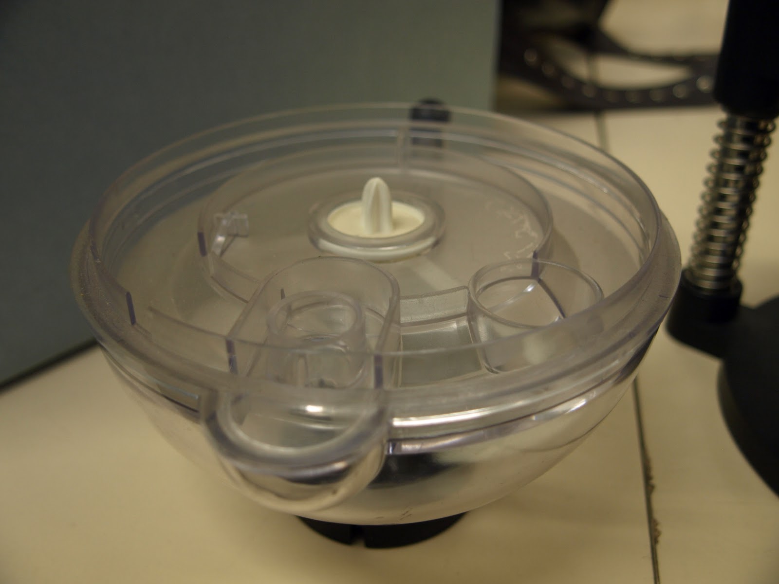
I also found a very interesting looking coffee maker/ mixer (I'm not sure what it is exactly), to me it looked like a robot which I found interesting as this was an old design and I tried to incorporate this idea into the mascot design I made from it.


The Betty Smithers Design Collection: Looking To The Past To Design The Future


I really like the juicer lady design that I have done as I feel it is bold and simple which would suit as a logo that can be put on merchandise. In terms of anthropomorphism, I like that the object itself has been turned into an extension (dress) of its function (juicer lady) and hasn't simply had eyes added to it as is the case with many anthropomorphic objects.

Tuesday, 6 December 2011

Drawing- Post 9

A short while ago I visited my home town, and while I was there I spent a weekend drawing in the graveyards nearby; I know that the original task was to draw in Hanley cemetery but since the task was more about mark making I hope that the cemeteries of Herne Bay will suffice.

I used a fineliner pen to create these drawings, using techniques such as hatching and stippling (which is a particular favourite of mine), I think that using the pen made me focus more and work faster as each stroke was a definite one so I had to be confident in my marks. I also brought along my watercolours but it is not my favourite medium, still, I think I managed to create a couple of nice pictures with them- I particularly like the texture of the gravestones.


Drawing- Post 8

Here are the last batches of Post-it notes continuing on from the 7th Drawing post.

Notes 74-150:


And here are my 50 favourites:

I have chosen the following drawings because I feel they captured the general essence of the person or pose I was studying and I think that the energetic lines I use to create my larger pieces have come through really well in these notes. 
Overall I found this task to be challenging due to my lack of speed and the constantly moving models but I feel I have benefitted from doing it and it is a practise I hope to continue.


Thursday, 1 December 2011

Drawing- Post 7

Here are the next batch of Post-it notes continuing on from the 3rd Drawing post.

Notes 49-73:

Wednesday, 30 November 2011

Drawing- Post 6

Recently, us VFX students were given a lesson involving silhouettes and their surprisingly wide range of functions and the almost endless things you could construct with them. As an exercise we were given sheets of silhouetted objects (guns for example), and we were asked to create something from these parts.

I found this task to be very enjoyable and enlightening, I didn't appreciate to what extent you could use silhouettes and I actually think this is a good technique to adopt for opening up one's creative channels.

Here are my results from the session:

Tuesday, 29 November 2011

Research For Animation & VFX- Post 9/ Drawing- Post 5

As a crossover between our drawing module and our research module we have been asked to apply our knowledge of anthropomorphic characters to draw our own anthropomorphic character.

We have been given the task of creating an anthropomorphic mascot for the Betty Smithers Design Collection using one of the objects from the collection as inspiration.

Here, I have used a juicer as the base for my character designs, I quite like my ideas but I'm not sure how well they represent the whole collection.

Initial sketches/ studies:


Refined ideas:

Drawing- Post 4

Here is the next batch of post- it note drawings continuing on from my 2nd Drawing post.

Notes 24-48:

Monday, 28 November 2011

Drawing- Post 3

A while ago, we were given the task of creating a building from a selection of different buildings with contrasting architectural styles.

Here are my sources:


And here is my idea:

Sketch:


Clean Sketch:

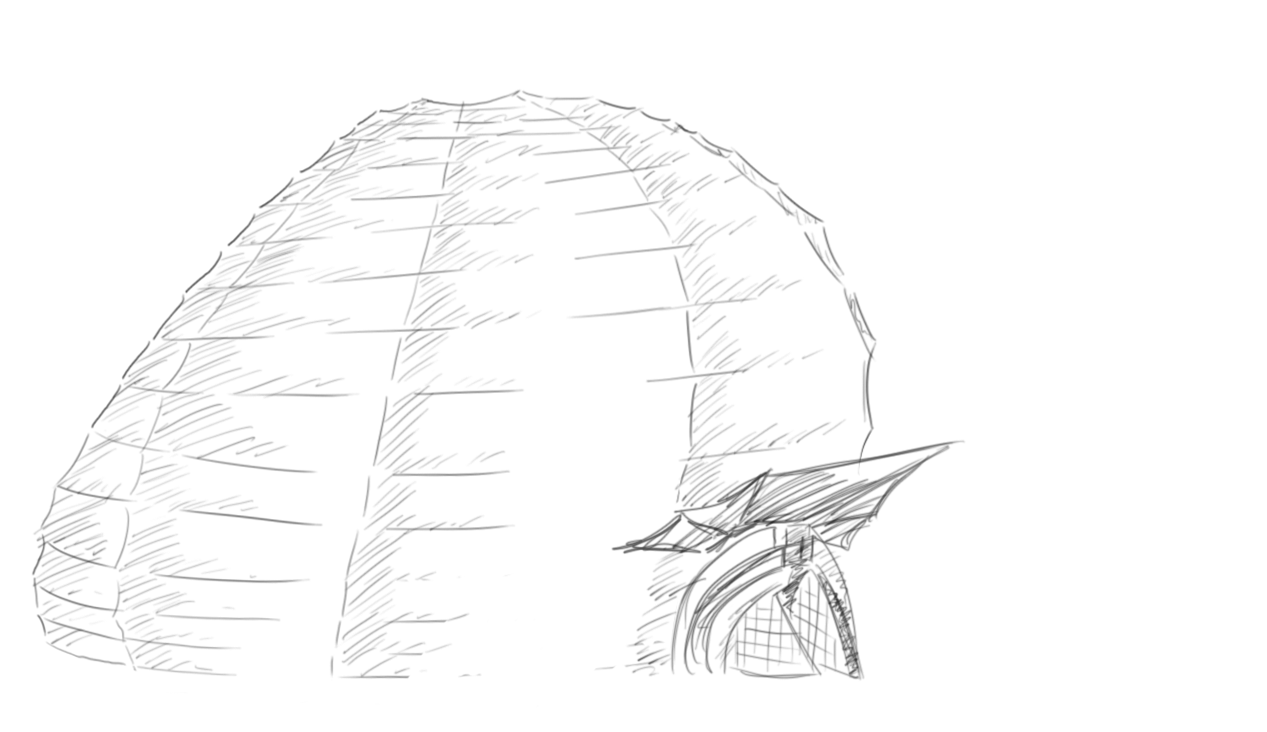
I was interested in the paper lamp aspect of my design, I thought it would be a very attractive looking building once it was lit up at night; on the inside of the building I imagined there to be multiple floors and near the top of the building I would've put a balcony. If I were to continue with this design I would incorporate a lot more of the Art Nouveau style to it as well as the rounded support beams from the 2nd and 3rd images.

Life Drawing- Post 5

This week (meaning the Tuesday session on 22nd November) the session involved using giant letters placed around the model in order for us to focus on using them as markers when drawing the figure.

I have mixed feelings about the drawings I produced, I feel I did well with using the letters as guides rather than falling into the trap of drawing the letters themselves, but once again my lack of speed meant I couldn't  achieve much with each drawing and I found the reclining poses quite difficult. With the final image, I tried to be loose with my lines and rather than follow the form with accuracy I tried to simply capture the general arcs of the forms.

I also found the scaling to be quite a strain this week; I used the scaling technique and started drawing, but after the figure kept seeming to change each time I put charcoal to paper and I got very frustrated with the drawing (number 3 specifically) I resigned myself to just drawing the figure so I would have at least something, but it would turn out correct anyway. I don't know whether to be annoyed by this or pleased as it makes me very unsure about whether I'm scaling things correctly.


Research For Animation & VFX- Post 8

This week, we have been asked to post up the draft introduction to our essay in order to identify our strengths and weaknesses when writing formal language.


My Essay Question:

Explore the ways in which the character of Rango embodies the classic Western hero.


(Draft) Introduction:

'Rango' is a critically acclaimed computer animated Western Comedy that follows the journey of a lost pet chameleon who, through his colourful but untrue stories, finds himself appointed Sheriff of the troubled desert town of 'Dirt'; the film shows the trials of this anthropomorphic chameleon on his way to becoming a hero.
Possibly the biggest reason for this film's success is the way that it encapsulates the Western genre, from the character designs that caricature classic Western stereotypes, to the creative references of Western classics that the film drew inspiration from. Rango himself has been constructed from an array of personalities including Hunter S. Thompson and Clint Eastwood.
Through this essay, I aim to explore the ways in which the character of Rango embodies the classic Western hero by breaking the character down and analysing him against the figures he was inspired by; I will also be looking at the anthropomorphic traits of Rango that lend to the more symbolic aspects of the character with regard to representing the Western hero.

Monday, 21 November 2011

Research For Animation & VFX- Post 7

This week, we have been asked to write about 1 interesting thing we have done during the week that relates to animation or VFX.

I have decided to review the film 'Season of the Witch' for this post as I saw this film for the very first time during the week.

Overall, the film was flat; the plot was boring and nonsensical at times, the dialogue felt extremely manufactured, and there was no character development at all.

The thing that interested me though was the use of makeup vs VFX within the film.

The VFX was weak and made this film look cheap, and even though the film only had a budget of $40million I felt that the VFX could've been utilised much better than it had been; the fantasy landscapes had been inserted fairly well for example, but it was the creature design that ultimately let the film down- the creatures did not blend well with the live action scenery or the actors that had to interact with them.

However, the physical makeup within the film was extremely well done, to the point where I had to look away at times. A part of the story is the spreading of the Plague or Black Death, thought to be the work of a witch, and so there were a lot of rotting bodies and infected characters. I thought that these makeup effects added a lot of atmosphere to the film and I actually felt more of a threat when the main characters were around Plague victims rather than the supernatural creatures!

I think that this film is a good example of why we shouldn't become too reliant on VFX, it is so readily available that anyone can use it, filmmakers have become lazy in their use of it and audiences have grown so used to it that VFX can no longer carry a film like it used to; in fact, below par VFX can now hurt a film.
Instead, I think that physical effects, such as the ones used in this film, should be used more than they are as they are much more organic than CGI and they connect the audience on a much deeper level.